You may have had the problem when embedding your HTML5 store on your website that you give the store a fixed width for your Desktop website, but when it's viewed on mobile the store is too wide for the mobile view. This means the store is not "responsive" or not responding to the width of the screen.
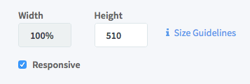
There's two ways to fix this - you could use the Responsive option before copying your store embed code:
But this will make your store full width of the screen for both desktop and mobile.
The better solution is to use the Responsive option in combination with a bit of CSS styling to change the width of the store depending on the width of the screen your website is being viewed on.
You'll need to have a little experience with CSS going forward from here.
First, take your typical HTML5 store embed code.
<iframe id="mfs_html5" src="https://airbit.com/widgets/html5/?uid=710&config=202911" width="100%" height="510" frameborder="0" scrolling="no">
</iframe>
You'll need to add a CSS class to the <iframe>, you can call it anything, in this example we're using html5Store:
<iframe class="html5Store" id="mfs_html5" src="https://airbit.com/widgets/html5/?uid=710&config=202911" width="100%" height="510" frameborder="0" scrolling="no">
</iframe>
Then you'll need to add the following CSS to your website:
@media screen and (min-width: 750px) {
    .html5Store {
           width: 750px !important;
    }
}
Change both instances of 750px for your desired store width in Desktop view.
What this basically means is if the screen width is more than 750 pixels wide, fix the store width to 750 pixels wide, so no matter how much wider the screen is, the store will always be fixed at 750 pixels.
If the screen is smaller than 750 pixels wide, the store will revert to 100% width it has in the embed code, which will make the store look great on your mobile site :D
Hope that helps !

Ellis Houslin
Comments